In Defence of Winter Pastels
Florals for spring might not be groundbreaking, but florals for winter might have a certain fashion mogul turning on her Prada heels, writes Niamh O’Donoghue
I detest Winter – the cold, the seemingly perpetual gloom and the arduous layering of clothes. I was not made for life in the Northern hemisphere, despite what my fair, freckled Irish skin will attest. I will wear butter yellow and bright blue long into October and soft lavender perks up any dreary November day. A dousing of bright, joyful colour is my SAD lamp equivalent of a vitamin D booster: an instant mood pick-me-up.
There are two types of winter dressers. There are the sensible ones: the people who migrate into black wool like clockwork, who treat navy as a “fun pop,” who own gloves that match their hats and hats that match their scarves and believe this is a conscious style choice and not a personality choice (dear reader: it’s the latter). Black becomes default, navy the variation, grey the punctuation.
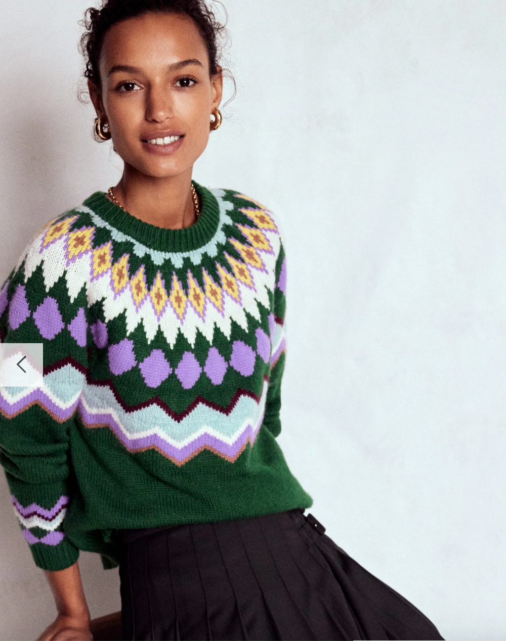
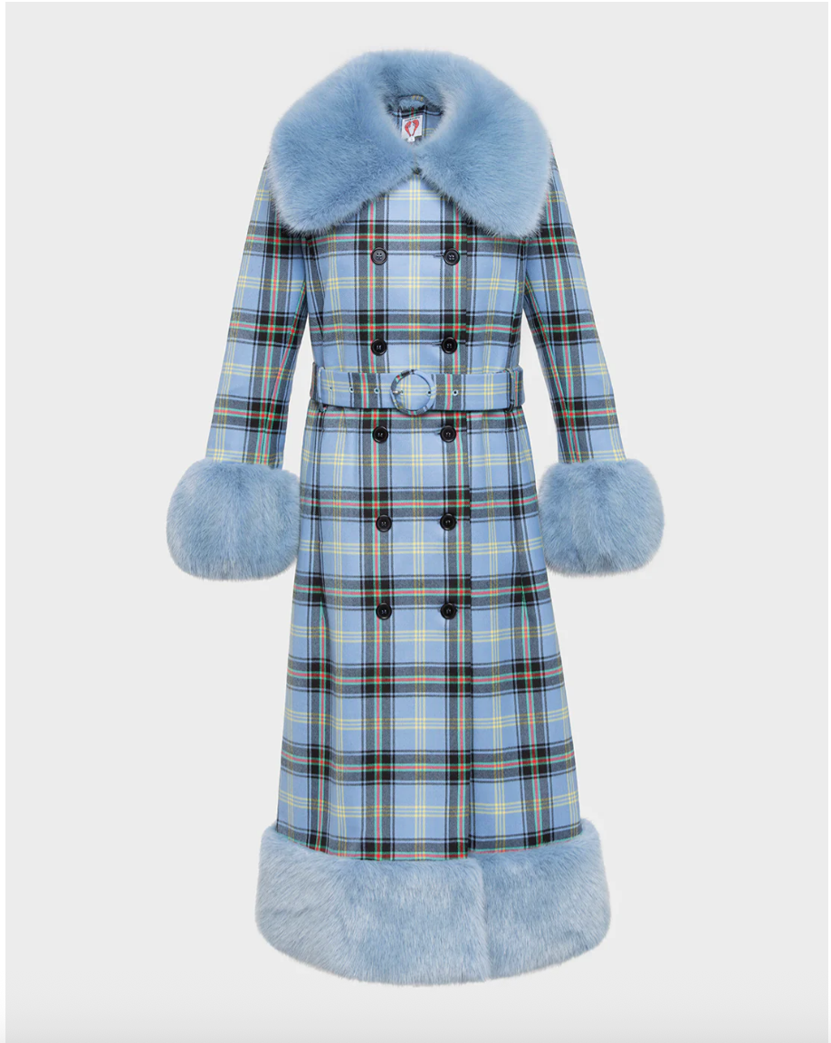
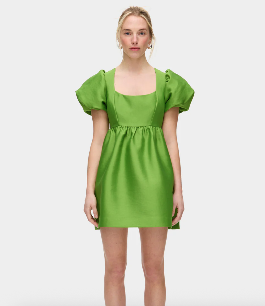
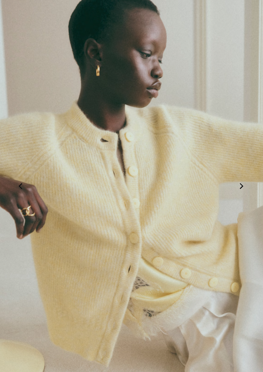
Then there are the B type winter dressers, the ones staring into our wardrobes from mid-October thinking, ‘Surely there must be another way?’ Surely the calendar turning colder doesn’t mean our wardrobes must mimic an Irish funeral procession. My sartorial tonic? Washed-out hues like eggshell blue, lavender and punchy chartreuse offer a welcome relief from grayscale, without being jarringly unseasonal.
Much like the rules we’ve created around winter dressing are actually rules we’ve inherited, absorbed until it becomes the ‘norm’. And few rules are as persistent as the idea that pastel colour belongs exclusively to spring.
Yet historically, this wasn’t always the case. Before the industrialisation of fashion ‘seasons’, colour wasn’t dictated by month or mood. In the 18th century, powdered pastels dominated European courts year-round; winter portraits of aristocrats show clouds of petal-pink silks and eggshell-blue velvets. These were not soft, shy shades but expressions of status. Pastel dyes were expensive, inconsistent to produce and intentionally impractical. Wearing gentle colour in cold weather signalled wealth precisely because of its frivolity. You didn’t have to dress for the elements if you had servants, carriages and rooms heated by actual fires.
By the mid-20th century, however, fashion became disciplined by the commercial calendar. Pastels were re-categorised as “spring colours,” tied to Easter merchandising, post-war optimism and the rise of predictable retail cycles. What once signaled power became a seasonal cliché. Winter, meanwhile, darkened: a palette of efficiency, professionalism and seriousness, all qualities Western culture associates with cold weather and productivity. Dressing softly in winter began to seem unserious, even juvenile. Something to age out of.
But every winter, as daylight shortens and emotional bandwidths contract, the logic begins to crack. Pastels do something counterintuitive and distinct: they soften the edges of the season. While colour psychology is an imperfect science, research consistently shows that lighter hues — blues, lavender, muted yellows — correlate with lower perceived stress and higher feelings of calm. This effect matters in winter, when mood often dips and the visual environment becomes a monotone of steel skies, concrete and coats that read like camouflage.
To my darker-hued dressers, I’m not discounting your style choices, and there are actual science-backed reasons behind dull weather dressing: Heat absorption.
Dark colours, particularly black, absorb more sunlight and can make you feel hotter in winter months. For those winter dressers who would never sway away from the comfort of their favourite black mohair knit, consider elevated punctuation.
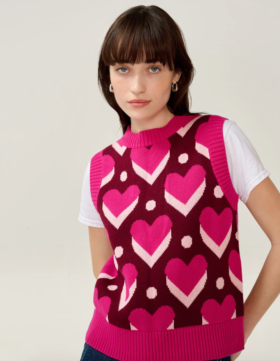
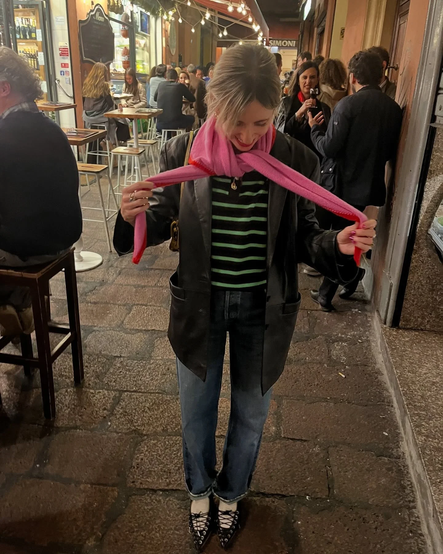
“Darker seasonal colours do have their place, but I love to mix them with a contrast or a pop: brown with light blue, mustard yellow or candy pink looks a treat,” says Bethany Rowntree, stylist, writer and curator of Studio B, ‘a directory of lovely things’, on Instagram and on Substack.
“Talking of pink, mix it with burgundy. Or, try a bright grassy green (or lime) mixed with grey or navy, trust me, it works!”.

For Bethany, winter dressing is about the joy in the unexpected, "Hit 'em with the old razzle dazzle,” sartorially speaking. A ditzy floral print makes a subtle winter statement when paired with dark indigo jeans (or burgundy corduroys!). Electric blue offsets festive red with refined ease. Pastels? A year round neutral, if you ask me.
“I usually like to go with the antithesis of a season," says Bethany. “For example: I love sequins in summer, but I won’t be wearing them in December, same goes for black for me.”
If you’re not quite ready for a ‘eureka’ wardrobe moment this winter, consider a classic colour combination instead.
“I am definitely an advocate of dressing colourfully in winter; we all need a little merry and bright when it’s dark and cold and a good colour combo really does make strangers smile! Speaking of which, I’ve loved some pieces from Sandy Liang this season who’ve done some beautiful colour combo stripes. And I think the return of colour we saw in the SS26 shows (I still dream of that Prada colour palette) looks set to continue into AW27 (I hope!).”
Words by Niamh O’Donoghue
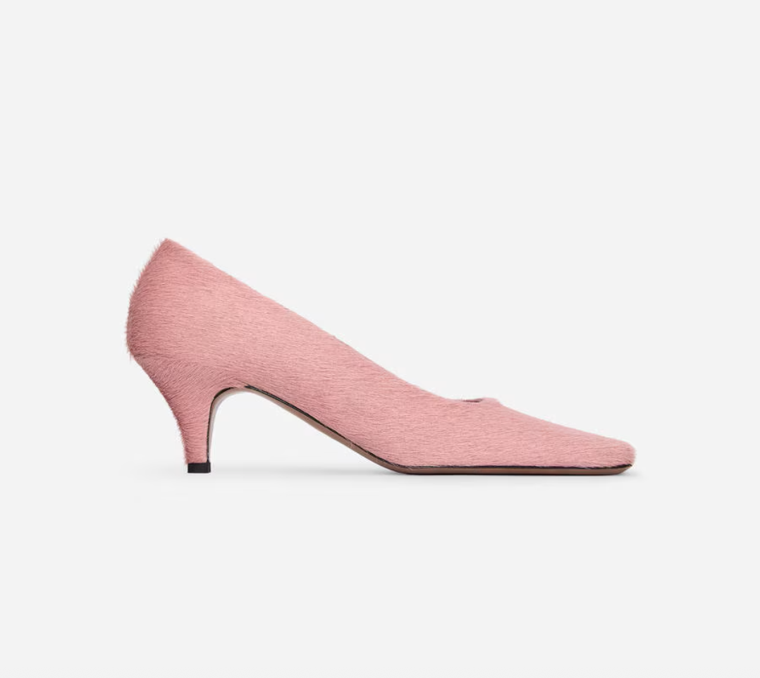
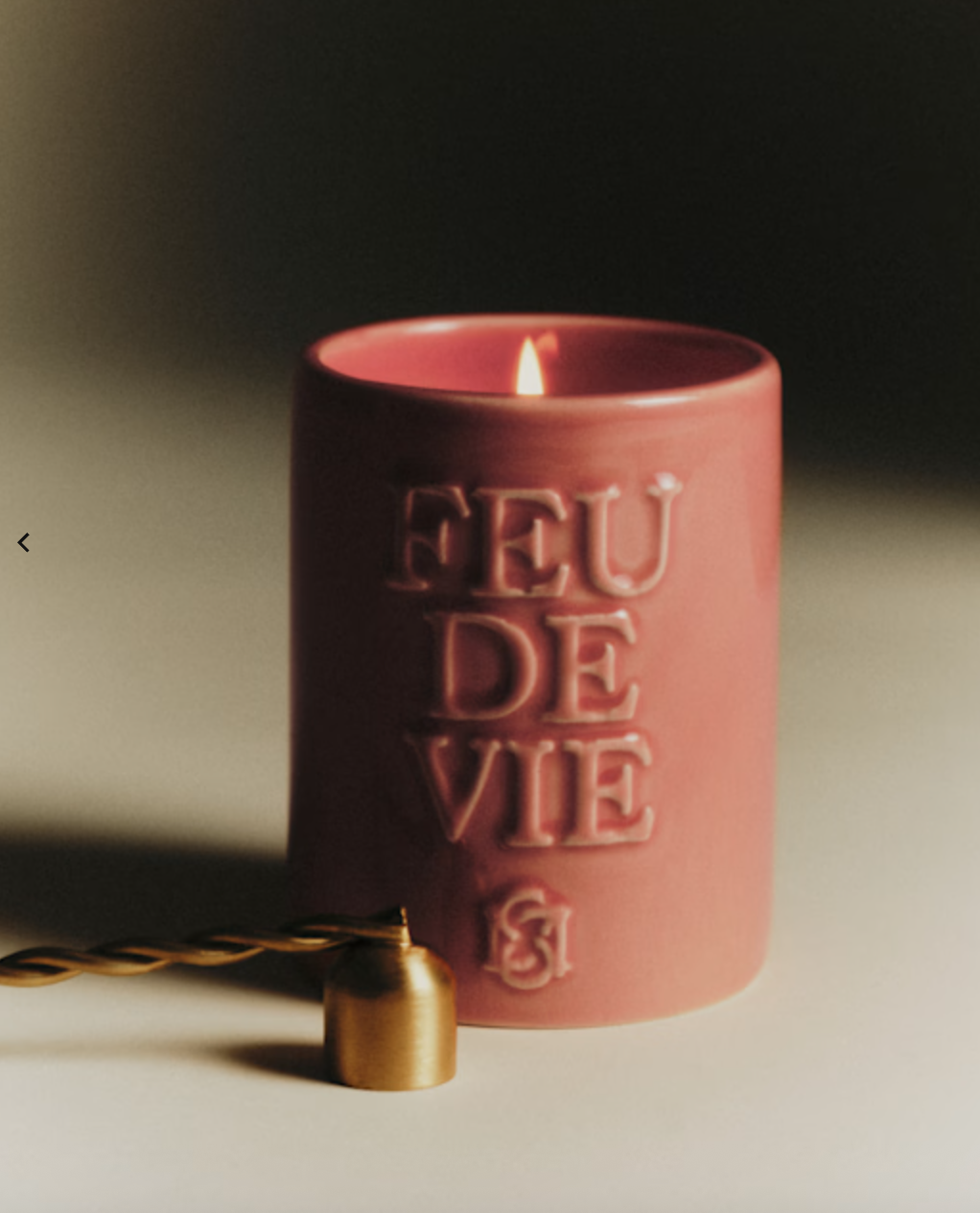
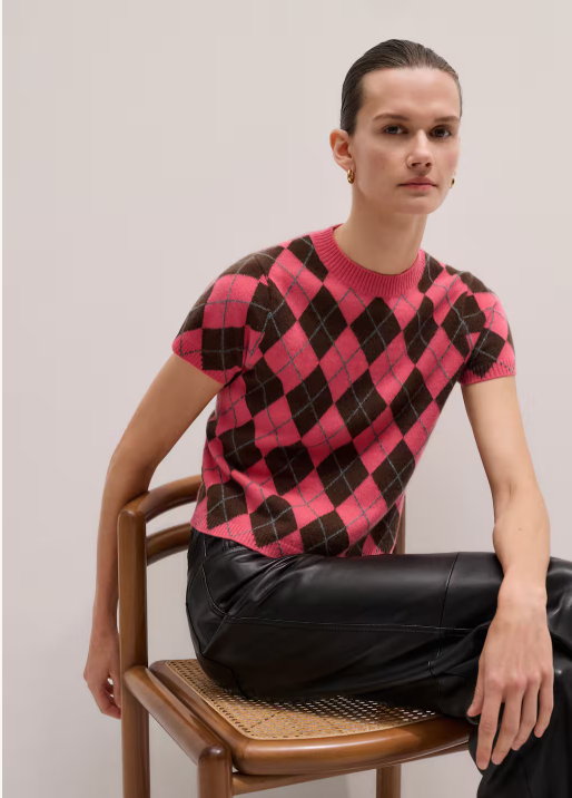
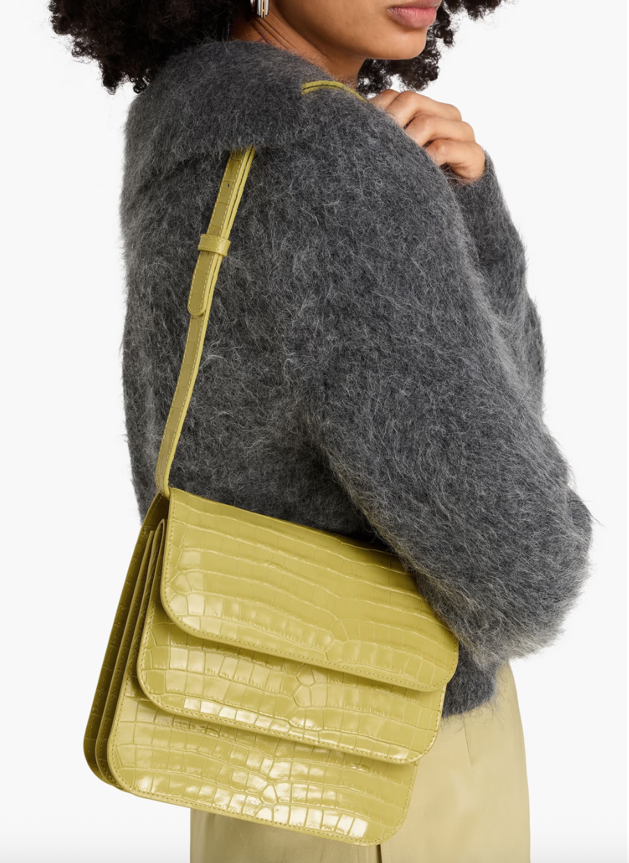
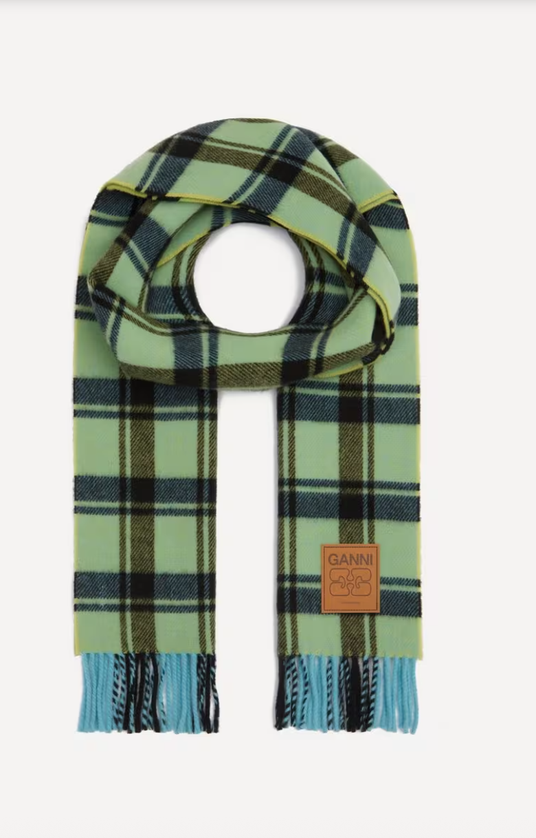
Ready to be a winter disruptor? Here are 10 wardrobe and home fundamentals to brighten up the darker months ahead.